
Eye cathing color
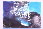
The most striking thing about Amy Storey’s work is her use of color. An untitled piece immediately caught my eye. Three colors were used; blue, purple, and black. Perhaps it was how the colors are arranged on the 24 x 40 off white paper.
Like most of her work, the pigments appear in chunks. The artist bleeds her colors by a unique blending technique. Overall, the work gave me a sense of fluidity, as it conveyed the many properties of a liquid.
The most vivid of colors in the work is a highly saturated blue. The hue appears at the upper right hand corner.
It reminds me of the bottom of a swimming pool; it is a color which was familiar in my recent trip to the Yucatan. It is tropical. It is the patches of water which have been saturated by sunlight. It is my Colgate Total Care Gel toothpaste.
My eyes are led across the painting by lines of pigment. The colors are applied to the bare white paper which results in a horizontal stripe pattern.
They are drippings which provide an effective area of negative space. These drippings are done in such a way which reminds me of a childhood activity.
They look as if Storey has played with a straw at her dinner table, pushing droplets of a drink with the force of her breath.
Not only do these lines offer movement, but they also introduce a deeper more subdued tone of blue. This blue is strikingly different than the one on the right. This blue, beginning in the upper left hand corner, is a clear night sky without stars.
It is reminiscent of a pair of indigo denim jeans before a washing.
Above this wash, Storey applies an additional layer. Three splotches of deep purple appear. Collectively, they form the shape of a crescent. The application looks as if a spray can was held too close to the paper. These forms draw my eyes downward.
Along the bottom of the image there is a black mass. Veins appear through this shade. Storey’s technique results in a skin like texture. Like the belly of a woman who has recently giving birth, or the arm of an elderly man who once may have had the most brilliant of tattoos.
My eyes move to the right. At the right of center thy abyss of darkness in interrupted by a “cut out” of white. The shape resembles a fish. It is long in length, almost eel like. Maybe it is coincidence. But, this form also has a black beady eye. Above this shape the ocean blue appears again, leading my gaze to the final right corner of the work.
My favorite part of the painting is black wash that runs along the bottom half of the artwork. The paint applied here contorts to a kidney shape. It looks as if water was applied to the pigment in the process of drying, resulting in a cell like texture. Frog eggs, they look like a slide mount enlarged on an overhead.
The combination of color, technique, and placement allowed me to question the meaning of Amy Storey’s artwork. Many of the elements lead me to reminisce about my childhood through visual experience. I can’t help but wonder if the implications of the work were to display a sense of femininity. All of Storey’s work is womb like; the forms are fluent. Historically water has been used as a symbol of the female; parenting is the result of function.
Perhaps it is taboo, but I perceive the theme of Amy Storey’s collection is the biology and experience of the female entity.

More Stories

Human being? Or human doing?
People change. We will always change, whether we resist or ignore. This can be hard for those who cling to the past-you you no longer identify with. People will call you angry when you’re calm because you used to be hard to sit with. Or they’ll call you impatient, even though you’ve learned to wait. […]
Pearl’s goodbye to The Spartan
I didn’t always think the newspaper business was for me, which is extremely ironic considering my major and how long I’ve been involved in the Castleton Spartan student paper. Now, especially considering my internship at the Rutland Herald, it feels like the logical next step. I’m graduating this semester, and although I’ll miss a lot […]

Women’s hockey looking to bounce back
The women’s hockey team is heading into the break this week, but before they do, let’s recap the last few contests. They hit the road for Boston at the end of the month, where they faced conference opponent the Beacons. In their game Friday, that top line of junior forwards for the girls of Moa […]

Not your average “Soccer Mommy”
So, I love music, and I love it a lot. I’m primarily a fan of heavier music, as I cannot enjoy “today’s top hits.” But, I still enjoy genres like Indie and Alternative. I attended my first concert on Sept. 24, 2021 in Burlington, Vermont. The artist? Soccer Mommy. Now, I had heard of Soccer […]

What the Hell Happened? Sports bloopers
Alrighty, I’ve been given the green light to share some more sports news. As always, with all the highlights being praised on the news, I’m here to show you the goofs and wacky stuff that make you wonder “what the hell happened?” — Man, what a wild way to cap off a wild NFL season. […]
Day in the life of Jake Rick
Colleges are places of education for people pursuing knowledge and degrees in various different fields of study. But in the shadows, there are people who work around these institutions so that people can continue to further their education successfully in a pleasant setting. Jake Rick is a Castleton University grounds supervisor whose job is to […]